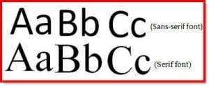
Font selection is very important when developing an educational material. Here are some helpful things to consider when choosing your font style for print materials:
Font styles (typeface)
- Choose fonts that are easy on the eyes. To improve readability, select a serif font for your basic text. Serif fonts have been proven to be more readable for text than sans serif fonts. Examples of serif fonts include Times, Times New Roman, Garamond and Georgia.
- For headings and subheadings, use a sans serif font, which will provide contrast from your body text font. Examples of san serif fonts are Arial, Geneva, Helvetica, Lucida Sans, Trebuchet and Verdana.
- Avoid using fancy or script fonts, which are often difficult to read.
- To keep your document looking clean and unified, use no more than two to three font styles per document.
Font size
Type that is too small can be hard to read. For the main body text, make your type size at least 12 points, ideally 13 points, but no larger than 14 points. For headings, use a font size two points larger than the body text.

