Written by TEAM Lab Graphic Artist Deron Yamada
During our recent Health Literacy Webinar, which was recently recorded, Michael Villaire discussed how font choices should be simple and novelty fonts should be avoided. However, we just wanted to share with you that font choices or typography is an easy way to add more visual appeal if photographs and other imagery are lacking.
Typography in design is a necessity and the choice of font says a lot. Elegant, classic, futuristic, retro, dynamic, gritty, edgy, … your typeface selection can set the tone of the design and communicate so much.
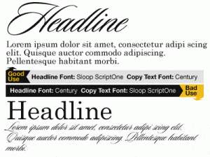
First, there are Headline/Display fonts which are used at larger sizes, usually 18 points or larger and there is more freedom for decorative styles (just don’t go overboard).
Secondly, there are Body Text fonts that are legible and easy to read at 14 points or less, these should be more of a classical/basic text font that is comfortable to read extensively.
Here is a good and bad example of how font useage:
Here are a list of free font sites (for Mac OS and Windows) that can help with your design:
- FontSpace
- Font Diner
- DincType
- Blambot Comic Fonts & Lettering
- UrbanFonts
- Font Sugar
- Fontleech
- Exljbris Font Foundry
Smashing Magazine has a great list of info for typography—dos and don’ts, etiquette, font selection, tricks, etc.
Happy font searching!

